Monday, April 11, 2011
Monday, April 4, 2011
Monday, March 28, 2011
Monday, March 21, 2011
Monday, March 14, 2011
Sunday, March 13, 2011
Flower Power
Sunday, February 27, 2011
Mad House
Panda Bear
Sorry Lieren- Rules of Composition
Here are my Ten Rules of Composition. I took a trip with my best friend Lieren to Eastern Market for her birthday, needless to say she became my model for the morning.
Rule #1- Impact: I thought this was the best example of impact because I captured a really genuine moment, Lieren didn't even know I was taking the picture.
Rule #2- Cropping: In this picture, I cropped out most of the scene so I could show the little kids as the center of the photograph, which is similar to the world they were in at the time.
Rule #3- Biggest, Boldest, Brightest most favorably placed: Coffee is something that is most favorable in my life so I made it the main focus of this picture.
Rule #4- KISS: Keeping it simple with a flower bud I found. The first signs of spring!
Rule #5- Rule of Thirds: Crepes at Eastern Market fill me up! So I decided to have the crepe fill up 2/3rds of the picture. It creates emphasis and a cool dynamism.
Rule #6- Leading Lines: I thought this was a great example of leading lines because the street, trees, cars, everything formals perfect lines to follow to the central focus, the Capitol Building.
Rule #7- Balance: I wanted to use this one because I thought it was an interesting balance of light and dark within the frame.
Rule #8- Use of Framing: I wanted to frame the dog in this photograph. He was looking so longingly at the door leading to food it made me think of someone waiting to get into the gates of heaven.
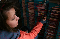
Rule #9- Avoid Mergers: I could have easily had one of the green poles direction behind Lieren's head and created illogical closure but instead I was sure to offset the background with the beams going diagonally.
Rule #10- Room for logical movement: This picture allows the viewer to look toward the same direction as Lieren.
Sunday, February 20, 2011
Sunday, February 13, 2011
Point of View
Black and Whites
Saturday, February 12, 2011
Subscribe to:
Posts (Atom)